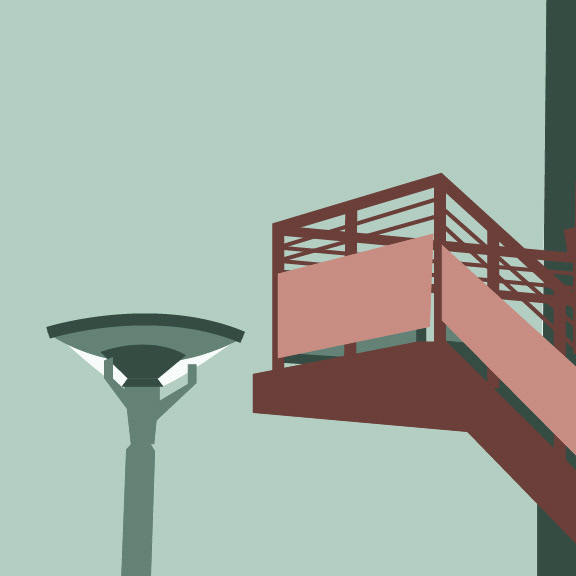
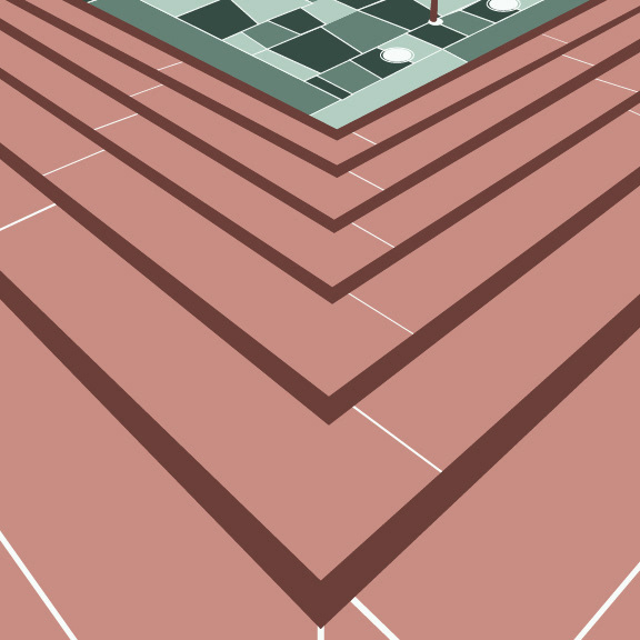
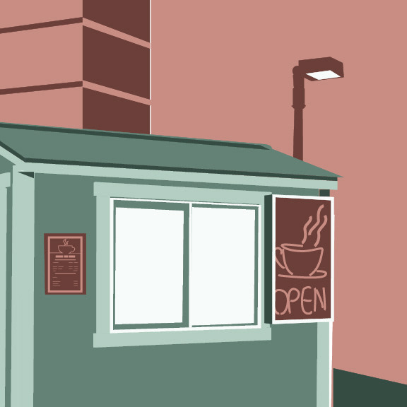
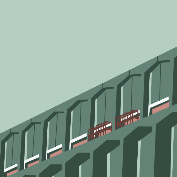
"Landscapes In Vector", 2019, Adobe Illustrator
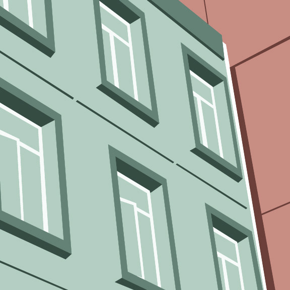
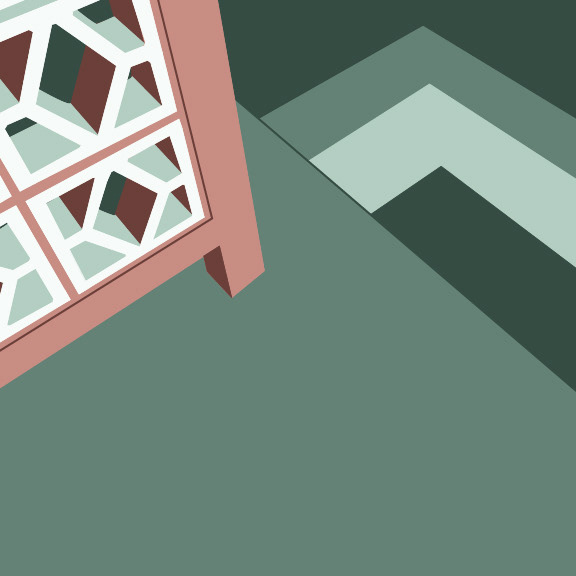
For this project we are introduced to manipulating vector shapes to the architecture of our daily school setting, using a color palette of our choice that holds some sort of meaning. For my color palette, I decided to go with a complementary color scheme, taking a toned-down approach to the classic red and green combo however, using muted shades like sage green, seafoam, a dusty brick tone, and then white as an additional non-color supplement. The colors hold a playful ironic contrast, in that because there’s the overpowering use of the green in my work, which has always been a universal color for nature, despite our buildings having a more modern and city feel. This project not only allowed for creativity in the more simple vector art style, tested my instincts and intuition for color theory in design.


